Seuratify

Setting the scene
I’ve increasingly enjoyed looking at art through an “algorithmic” lens. What are the “hard” rules that generating a piece of art require, and can they be recapitulated using a computer?
Of course, generating more or less “random” art is always possible, for example using GAN (Generative Adverarial Networks). Such type of art has generated lots of traction recently, as shown by the incredible success of the “Belamy” family. However, here I am more interested in “transforming” an pre-existing display, closely following technical artistic rules used by painters.
Seurat
Seurat was a French painter. Relying on its own interpretation of “Loi du contraste simultané des couleurs”, a lengthy piece of writing from Michel-Eugène Chevreul, he revolutionalized the way painters would fill their canvases. Rather than pre-mixing colours first to make a “continuous” painting, he would instead only apply dots, or very short strokes of paint on a canvas. Closely looking at a composition from Seurat, one would distinguish each invidual dot, but looking from afar, each dot would blend with neighboring ones, resulting in a unique feeling of brightness.
Seurat in 2021
I decided to make a 2021 version of Seurat’s work.
First, let’s fetch a random image from the Internet:
library(tidyverse)## ── Attaching packages ─────────────────────────────────────────────────────────────────────────────────────────────────────────────────────────────────────────────────────────────────────────────────────────────────────────────── tidyverse 1.3.1 ──## ✔ ggplot2 3.3.3 ✔ purrr 0.3.4
## ✔ tibble 3.1.2 ✔ dplyr 1.0.6
## ✔ tidyr 1.1.3 ✔ stringr 1.4.0
## ✔ readr 1.4.0 ✔ forcats 0.5.1## ── Conflicts ────────────────────────────────────────────────────────────────────────────────────────────────────────────────────────────────────────────────────────────────────────────────────────────────────────────────── tidyverse_conflicts() ──
## ✖ dplyr::filter() masks stats::filter()
## ✖ dplyr::lag() masks stats::lag()set.seed(100)
url <- httr::GET(
'https://pixabay.com/api/',
query = list(
'key' = '24754657-1e4850ee5c92aa34ee81fd3dc',
'per_page' = 200,
'page' = 1
)
) %>% httr::content() %>% '[['('hits') %>% '[['(sample(1:200, 1)) %>% '[['('largeImageURL')
download.file(url, 'image.jpg')
Perfect! Nice landscape. I can import it in R in a tidy tibble:
img <- jpeg::readJPEG('image.jpg')
img <- cbind(
    img[, , 1] %>%
        as_tibble() %>%
        mutate(y = as.numeric(1:nrow(.))) %>%
        pivot_longer(-y, names_to = 'x', values_to = 'r') %>%
        mutate(x = as.numeric(str_replace(x, 'V', ''))),
    img[, , 2] %>%
        as_tibble() %>%
        mutate(y = as.numeric(1:nrow(.))) %>%
        pivot_longer(-y, names_to = 'x', values_to = 'g') %>%
        mutate(x = as.numeric(str_replace(x, 'V', ''))) %>%
        select(g),
    img[, , 3] %>%
        as_tibble() %>%
        mutate(y = as.numeric(1:nrow(.))) %>%
        pivot_longer(-y, names_to = 'x', values_to = 'b') %>%
        mutate(x = as.numeric(str_replace(x, 'V', ''))) %>%
        select(b)
) %>% as_tibble()
## Warning: The `x` argument of `as_tibble.matrix()` must have unique column names if `.name_repair` is omitted as of tibble 2.0.0.
## Using compatibility `.name_repair`.img## # A tibble: 1,093,120 x 5
## y x r g b
## <dbl> <dbl> <dbl> <dbl> <dbl>
## 1 1 1 0.286 0.545 0.671
## 2 1 2 0.286 0.545 0.671
## 3 1 3 0.290 0.549 0.675
## 4 1 4 0.290 0.549 0.675
## 5 1 5 0.282 0.553 0.675
## 6 1 6 0.282 0.553 0.675
## 7 1 7 0.282 0.553 0.675
## 8 1 8 0.278 0.549 0.671
## 9 1 9 0.275 0.545 0.667
## 10 1 10 0.298 0.557 0.682
## # … with 1,093,110 more rowsI then “binarize” it in many tiny dots:
bins <- 400
df <- mutate(img,
    y = as.numeric(cut(y, breaks = bins, include.lowest = TRUE)) %>% scales::rescale(c(0, 1)),
    x = as.numeric(cut(x, breaks = bins, include.lowest = TRUE)) %>% scales::rescale(c(0, 1)),
) %>%
    group_by(y, x) %>%
    summarize(across(c(r,g,b), mean))
## `summarise()` has grouped output by 'y'. You can override using the `.groups` argument.df## # A tibble: 160,000 x 5
## # Groups: y [400]
## y x r g b
## <dbl> <dbl> <dbl> <dbl> <dbl>
## 1 0 0 0.288 0.547 0.672
## 2 0 0.00251 0.282 0.549 0.672
## 3 0 0.00501 0.289 0.552 0.676
## 4 0 0.00752 0.289 0.545 0.671
## 5 0 0.0100 0.300 0.550 0.678
## 6 0 0.0125 0.286 0.541 0.666
## 7 0 0.0150 0.285 0.543 0.669
## 8 0 0.0175 0.288 0.546 0.672
## 9 0 0.0201 0.282 0.550 0.673
## 10 0 0.0226 0.277 0.547 0.669
## # … with 159,990 more rowsHow does it look when plotted?
mutate(df, col = rgb(r, g, b, maxColorValue = 1)) %>%
    '['(sample(1:nrow(.)), ) %>%
    ggplot(aes(x = x, y = -y)) +
    ggrastr::geom_point_rast(aes(col = col), size = 0.1, raster.dpi = 200) +
    scale_colour_identity() +
    theme_void() +
    theme(aspect.ratio = max(img$y)/max(img$x))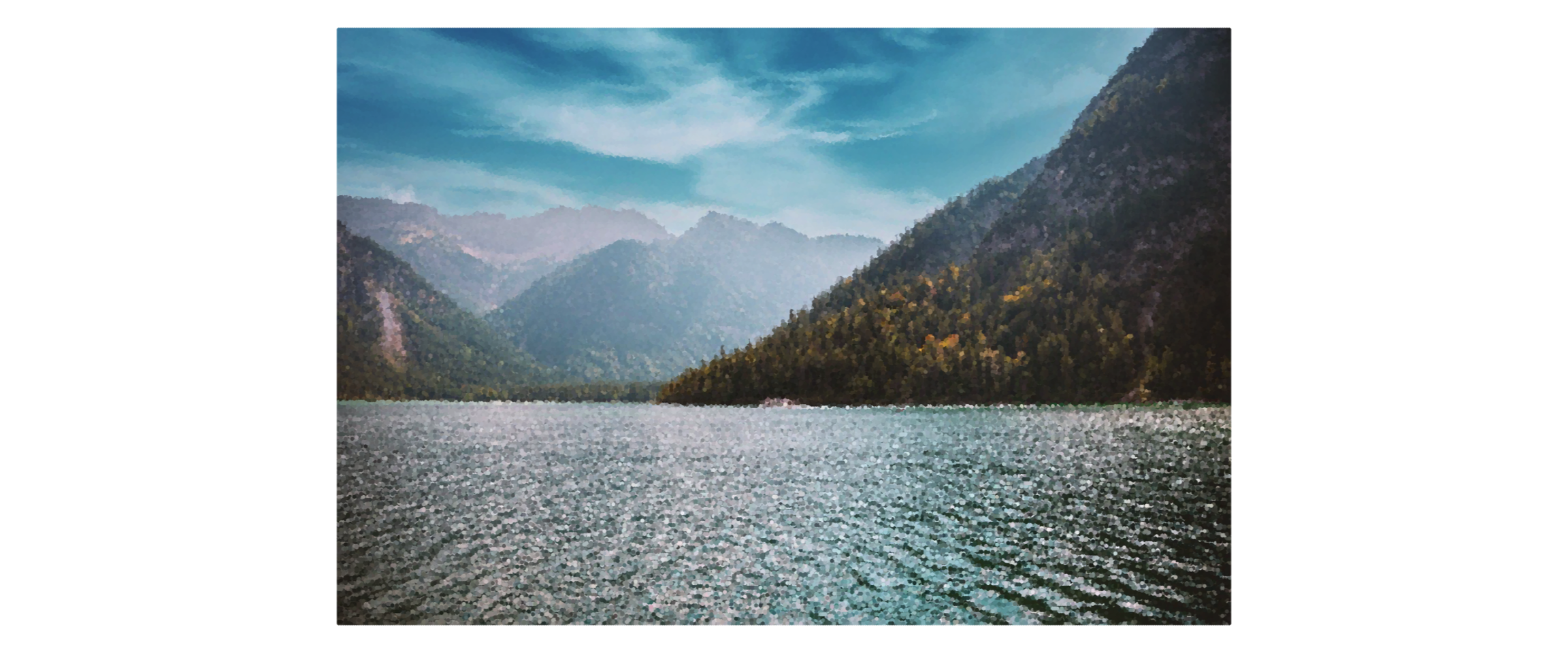
Cool! Maybe we can add a little jittering in the colors? It was what makes Seurat’s work so recognizable and sparkly.
ungroup(df) %>%
    mutate(
        r = r + sample(seq(0, 0.01, 0.001), size = nrow(df), replace = TRUE) - 0.005,
        g = g + sample(seq(0, 0.01, 0.001), size = nrow(df), replace = TRUE) - 0.005,
        b = b + sample(seq(0, 0.01, 0.001), size = nrow(df), replace = TRUE) - 0.005
    ) %>%
    mutate(
        r = case_when(r > 1 ~ 1, r < 0 ~ 0, TRUE ~ r),
        g = case_when(g > 1 ~ 1, g < 0 ~ 0, TRUE ~ g),
        b = case_when(b > 1 ~ 1, b < 0 ~ 0, TRUE ~ b),
        col = rgb(r, g, b, maxColorValue = 1)
    ) %>%
    '['(sample(1:nrow(.)), ) %>%
    ggplot(aes(x = x, y = -y)) +
    ggrastr::geom_point_rast(aes(col = col), size = 0.1, raster.dpi = 200) +
    scale_colour_identity() +
    theme_void() +
    theme(aspect.ratio = max(img$y)/max(img$x))
Almost there! We can now just adjust the position of each dot to make it look like it’s not perfectly aligned with its neighbors.
ungroup(df) %>%
    mutate(
        x = x + sample(seq(0, 0.05, 0.001), size = nrow(df), replace = TRUE) - 0.05/2,
        y = y + sample(seq(0, 0.05, 0.001), size = nrow(df), replace = TRUE) - 0.05/2,
        r = r + sample(seq(0, 0.01, 0.001), size = nrow(df), replace = TRUE) - 0.005,
        g = g + sample(seq(0, 0.01, 0.001), size = nrow(df), replace = TRUE) - 0.005,
        b = b + sample(seq(0, 0.01, 0.001), size = nrow(df), replace = TRUE) - 0.005
    ) %>%
    mutate(
        r = case_when(r > 1 ~ 1, r < 0 ~ 0, TRUE ~ r),
        g = case_when(g > 1 ~ 1, g < 0 ~ 0, TRUE ~ g),
        b = case_when(b > 1 ~ 1, b < 0 ~ 0, TRUE ~ b),
        col = rgb(r, g, b, maxColorValue = 1)
    ) %>%
    '['(sample(1:nrow(.)), ) %>%
    ggplot(aes(x = x, y = -y)) +
    ggrastr::geom_point_rast(aes(col = col), size = 0.1, raster.dpi = 200) +
    scale_colour_identity() +
    theme_void() +
    theme(aspect.ratio = max(img$y)/max(img$x))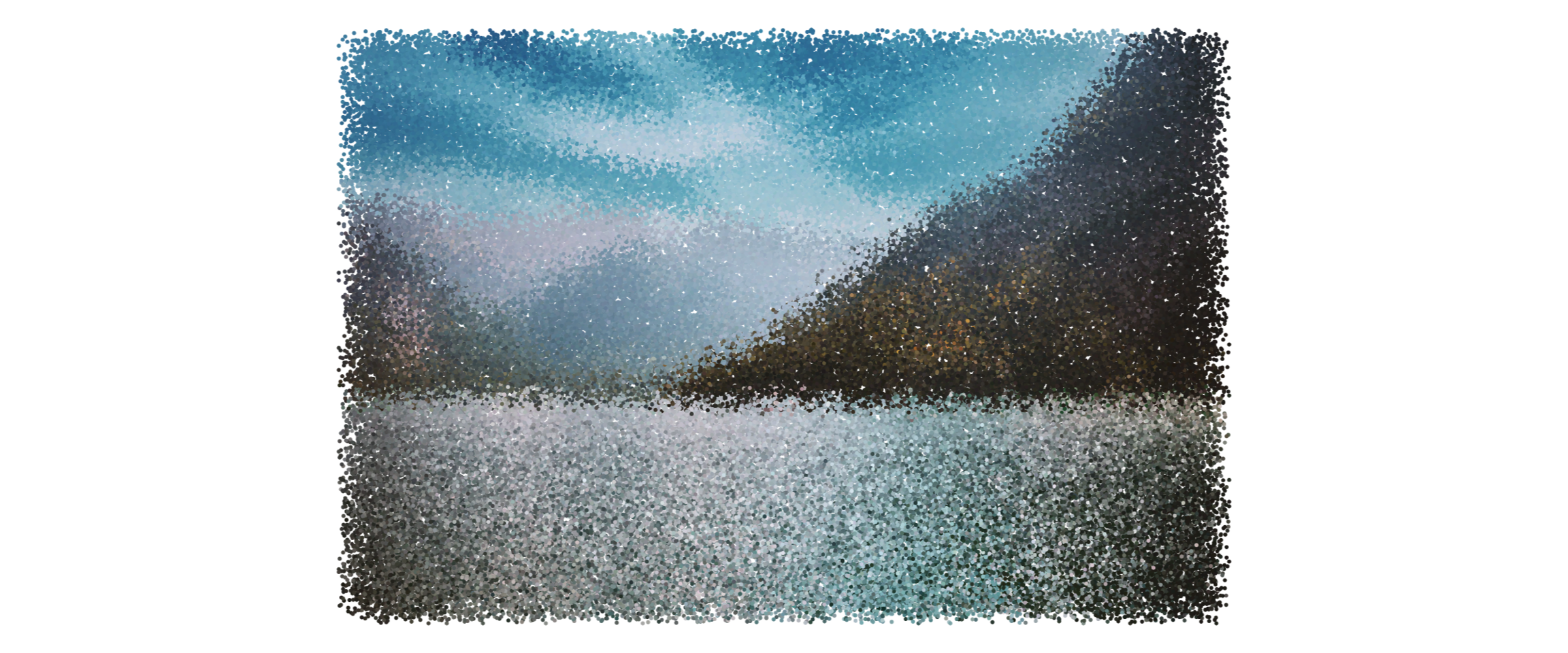
Woops, too much!
ungroup(df) %>%
    mutate(
        x = x + sample(seq(0, 0.005, 0.001), size = nrow(df), replace = TRUE) - 0.005/2,
        y = y + sample(seq(0, 0.005, 0.001), size = nrow(df), replace = TRUE) - 0.005/2,
        r = r + sample(seq(0, 0.01, 0.001), size = nrow(df), replace = TRUE) - 0.005,
        g = g + sample(seq(0, 0.01, 0.001), size = nrow(df), replace = TRUE) - 0.005,
        b = b + sample(seq(0, 0.01, 0.001), size = nrow(df), replace = TRUE) - 0.005
    ) %>%
    mutate(
        r = case_when(r > 1 ~ 1, r < 0 ~ 0, TRUE ~ r),
        g = case_when(g > 1 ~ 1, g < 0 ~ 0, TRUE ~ g),
        b = case_when(b > 1 ~ 1, b < 0 ~ 0, TRUE ~ b),
        col = rgb(r, g, b, maxColorValue = 1)
    ) %>%
    '['(sample(1:nrow(.)), ) %>%
    ggplot(aes(x = x, y = -y)) +
    ggrastr::geom_point_rast(aes(col = col), size = 0.1, raster.dpi = 200) +
    scale_colour_identity() +
    theme_void() +
    theme(aspect.ratio = max(img$y)/max(img$x))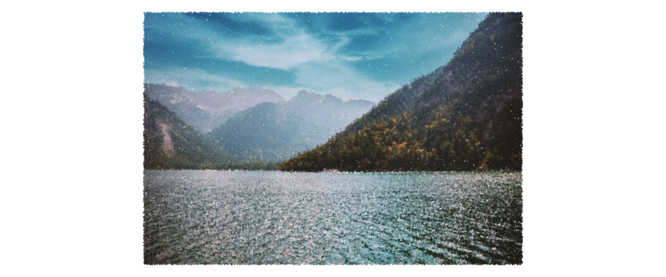
Et voilà! Comparing it with the original photo, it looks like the Seuratified picture has kept the brightness of the scene but with blurrier lines. Still, the ripples over the water and the